Some geeky frontend notes on the Full Stack Artisan website
At Laracon US we announced we're working on a new course at Spatie: Full Stack Artisan.
In Full Stack Artisan, we'll dive into building Laravel applications with Inertia, React, TypeScript, view models, our Laravel Data package, and more.
Last week I took a break from working on course content to set up branding and a landing page.

Just a website
For now, we needed a landing page with a Mailcoach subscription form. No PHP or static site generator, long live index.html & site.css!
public/└ img/ └ …└ favicon.ico└ index.html└ site.cssOur index.html is only 50 lines long, the majority being meta tags. Little HTML requires little CSS, so it wasn't worth introducing a build step to minify. All view-sourceable like it's 2008!
Modern goodies
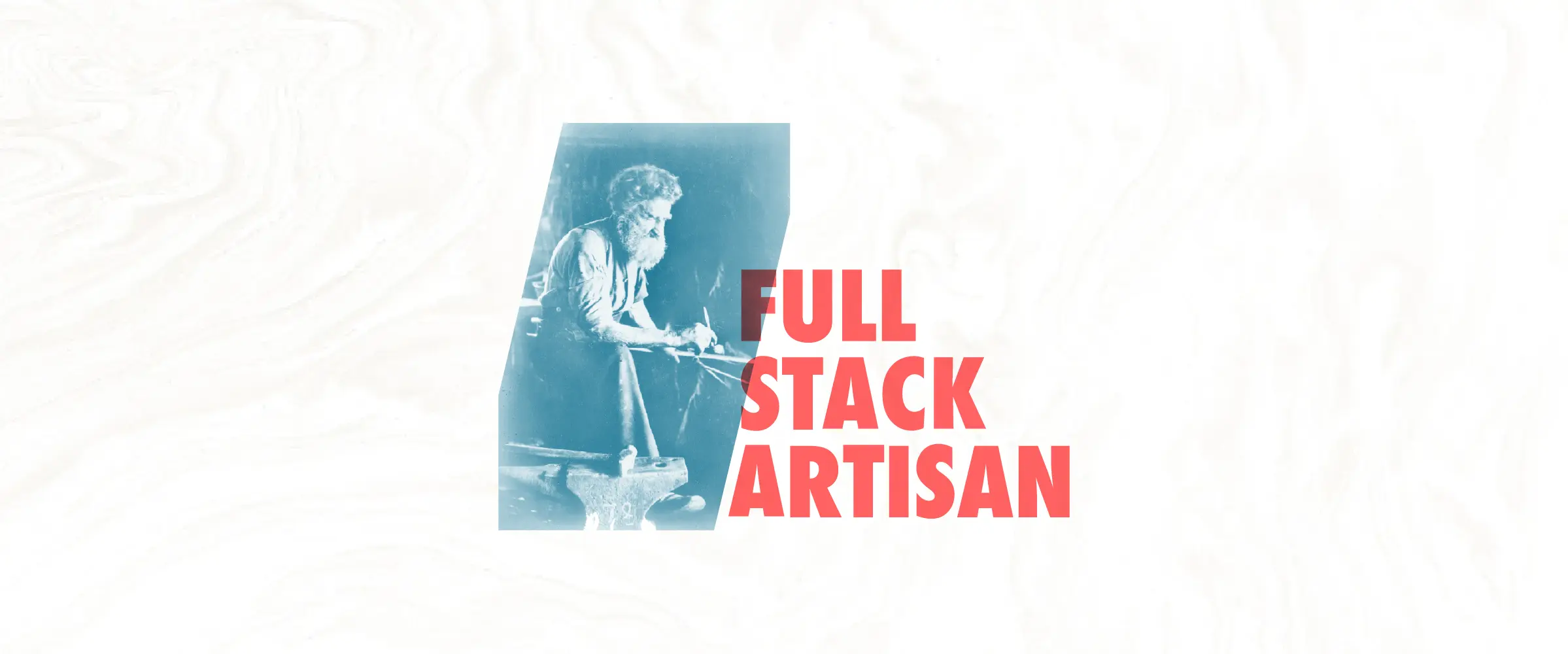
The header and background graphics are encoded in WEBP, a modern image format for the web. It's the first time I've actively used it, and oh my is it lean. The 180 KB background image shrunk down to 28 KB after converting from JPEG to WEBP using Squoosh.
I used the new-ish aspect-ratio property in CSS to define the header's aspect ratio, so the layout doesn't shift when the image starts loading.
.banner { aspect-ratio: 480 / 340;}I also had some fun with the CSS :target selector. Our subscription form redirects to https://full-stack-artisan.dev/#subscribed to display a flash message after a visitor subscribes.
#subscribed { display: none;} #subscribed:target { display: block;}I wrote a more in-depth article about :target on the Mailcoach blog.
In the coming months, Freek, Ruben, and I will be experimenting, writing, and recording the course. I look forward to share more on the thought process soon.
