Building Laravel Error Share

Last week, we released Laravel Error Share, a package to share local Laravel exceptions with a coworker or your debugging friend on the internet. We wrote all about the functionality of the package on the Flare blog. In this post, I'd like to look into some of the implementation details and considerations we made while building it.
As of two weeks ago, Laravel ships with a beautiful new minimal error page. At Spatie, we built and will continue to maintain Ignition, the previous error page. After the new one was released, some people were missing features Ignition provides that aren't available anymore. You can still install Ignition for a more detailed view when debugging, but we also wanted to have some core features from Ignition accessible as a "plugin" for Laravel's native error page.
The main feature we wanted to port—which was also by far the most requested one—was the share button. The share button on Ignition is probably one of my favorite open source things we've built over the years. It happens so often that I come across an issue on one of our projects and want to ask a coworker to help debugging. An interactive, shared stack trace with context is much, much more useful that a .png screenshot.
Laravel Error Share was built by my colleague Ruben, so most of the code I'll review in this post is accredited to him. I helped out with the design and feedback on the implementation.
We wanted to insert the "Share" button alongside the dark/light mode theme switcher in the top right of the error page. The template for this header is stored in the laravel-exceptions-renderer::navigation vendor view.
To override the vendor view, we created our own resources/views folder in the package, and register it under a custom namespace in the package service provider.
View::prependNamespace('laravel-exceptions-renderer', [__DIR__.'/../resources/views']);Next, we set up our own navigations.blade.php file which is a copy of Laravel's view. Ours has an added <x-laravel-exceptions-renderer::error-share> component that renders before the theme switcher.
<header class="mt-3 px-5 sm:mt-10"> <div class="py-3 dark:border-gray-900 sm:py-5"> <div class="flex items-center justify-between"> <!-- A bunch of other stuff… --> <div class="flex items-center gap-3 sm:gap-6"> <x-laravel-exceptions-renderer::error-share :exception="$exception" /> <x-laravel-exceptions-renderer::theme-switcher /> </div> </div> </div></header>We pass the exception object to the error share component so it can parse and transform it into a format the Flare API can digest for the publicly shared URL.
The downside of this method is we need to manually keep the package up to date with Laravel's upstream view file. To avoid being caught off guard by Laravel's changes, we added a snapshot test using Pest & our snapshot plugin that runs against the view in the vendor folder. This isn't perfect, because we'll only catch the updates when someone runs the tests or makes a PR, but it's better than manually having to verify.
<?php use function Spatie\Snapshots\assertMatchesFileSnapshot; it('still is the same laravel navigation blade component', function () { assertMatchesFileSnapshot(__DIR__.'/../vendor/laravel/framework/src/Illuminate/Foundation/resources/exceptions/renderer/components/navigation.blade.php');})->skipOnWindows();In the future, we'd consider making a PR to Laravel to make the error page extendible with slots or something similar, but this is good enough for now.
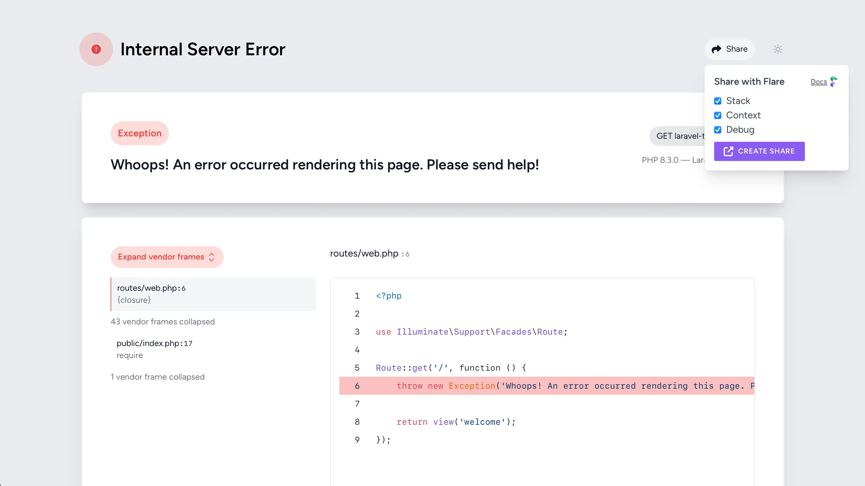
In the first version, we mirrored the style of the "Expand vendor frames" button with a heavy share icon. While this made the button stand out, it felt too prominent.

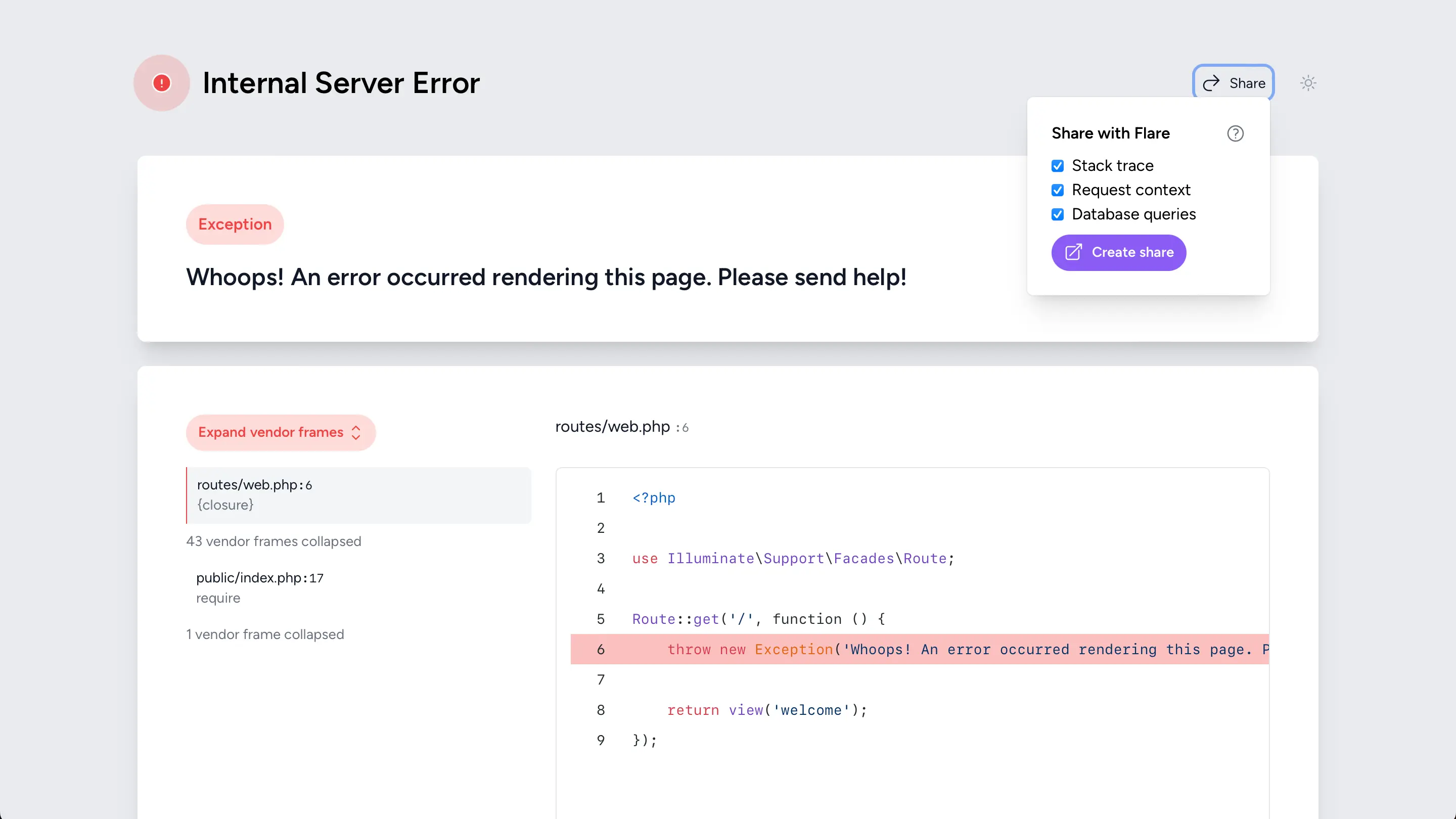
Instead, we took a more subtle approach similar to the theme switcher button alongside it. We browsed Heroicons (the icon library used for the other icons on the error page) for a good icon, and removed the button background to make it more subtle. We considered removing the label so it looked just like the theme switcher, but ended up keeping it because an icon alone isn't enough to convey the functionality.

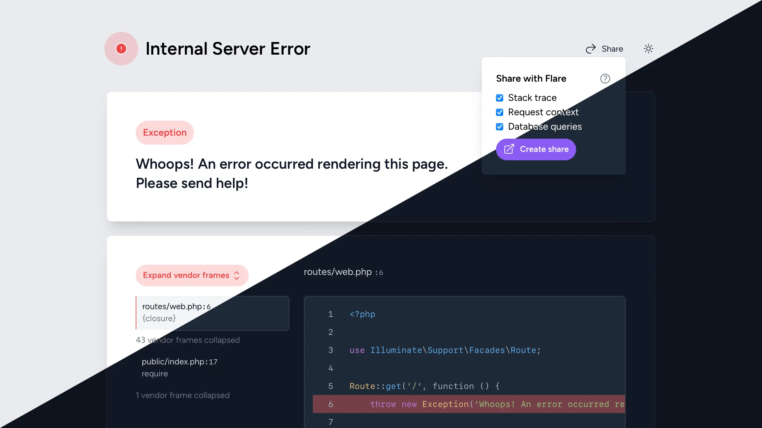
We also mirrored the theme switcher for the dropdown style. We decided to keep Flare's purple hue on the "Create share" button to have a subtle reference to the service without going overboard on branding in a dev environment.
And that's how Laravel Error Share was born! We're currently porting more Ignition features to Laravel's native error page so developers can choose between a selection of small addons or install Ignition for a complete revamp.
