I thouroughly enjoyed the walk through Pedro's design process for his personal website. From where he drew inspiration, to live snapshots of the design's iterations.
Last week, Unsplash added "blurhashes" to their API. Blurhashes are 20-30 character strings that represent a blurred placeholder of an image.
Blurred image placeholders aren't new, but I was completely stomped to see what kind of gradient maps are generated with only 30 characters.
In short, BlurHash takes an image, and gives you a short string (only 20-30 characters!) that represents the placeholder for this image. You do this on the backend of your service, and store the string along with the image. When you send data to your client, you send both the URL to the image, and the BlurHash string. Your client then takes the string, and decodes it into an image that it shows while the real image is loading over the network. The string is short enough that it comfortably fits into whatever data format you use. For instance, it can easily be added as a field in a JSON object.
Unsplash uses the BlurHash algorithm to generate the placeholders. BlurHash is not a library but an algorithm, and they have 5 first party implementations including TypeScript. There's also a third party package for PHP.
The algorithm is very simple - less than two hundred lines of code - and can easily be ported to your platform of choice.
"Why Do We Interface?" is a micro-book about interfaces over the ages: from cave paintings to Google Glass to your latest note-taking app. It's important to understand why we build interfaces in order to get better at building them.
The purpose of any interface, regardless of the technology, is to retrieve, decode, modify, and/or distribute information. […]
The core purpose of graphics in a GUI is not to be pretty
The purpose is to be informative.
Some questions to ask yourself when you're designing an interface:
How does the interface help us retrieve information?
Is it easy to decode the information that was retrieved?
Does the interface allow for easy and clear modification of information?
Does the interface assist in, and clearly declare when it is going to distribute information?
How will this interface redefine what it means to be human?
Number five is a bit too bold for my taste, but the first four are valuable guidelines.
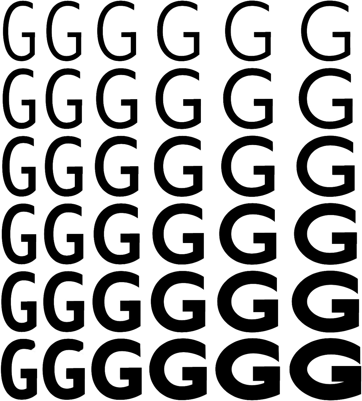
iA Writer is one of my favorite pieces of software, and I can't even say why. It just feels so good. In the upcoming 5.2 release, iA Writer will replace the current iA Writer Duo font with iA Writer Quattro, a variable font.
While traditional fonts offer in a limited number of weights, variable fonts offer an infinite scale between the weights and features.
Variable fonts have different "axis" which allow an infinite amount of variations.
In iA Writer 5.2 we automatically adjust the optical weight depending on the type size you use. Weights change depending on size. The font is getting thinner and tighter spaced as we increase the type size. This has not been possible in the past.
Not just size, but different screens demand different weights, too. Fonts look different on screens; some screens have more or fewer pixels, like retina and high-density retina. Depending on what device you use, we apply different gradings.
Our job would almost be boring if type size, pixel density, and screen type were the only challenges of modern typography. As you might have noticed, dark backgrounds make white text shine brighter. That’s why iA Writer 5.2 tones the optical weight down another 5% for night mode. Who does such crazy things? Crazy people.
I, for one, welcome our new variable font overlords. More words and pictures on ia.net.
If you want to learn more about variable fonts in general, or play around with a few specimens, check out Axis-Praxis.
I've been reading up on SVG and Bézier curves for a side project that involves a custom-made chart (blog post about that later!). Funnily enough, this article on Bézier curves popped up on Hacker News earlier this week.
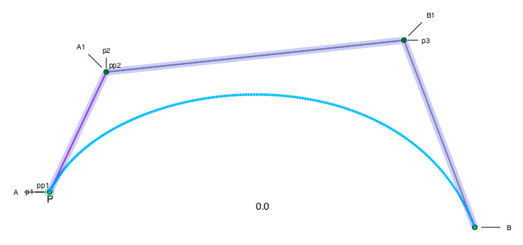
One little animation in the article totally stands out, and helped me make sense of what the control points of a Bézier curve actually do.
While you’re waiting, have a look at another animation; this is my artist’s impression of the De Casteljau algorithm dividing the control polygons around a Bézier curve as the parameter n moves from 0 to 1. The idea is that as p1 divides A to A1, p2 divides A1 to B1 and p3 divides B1 to B. So, pp1 divides p1 to p2, and pp2 divides p2 to p3. And you keep doing this until you can’t divide any more, and eventually the point P plots the course of the final Bézier curve. The red and blue parts of the curve show that this technique is also a good way to split a single Bézier curve into two separate ones, and the red and blue parts are separate control polygons.